As a top 20 insurance brokerage with 5,000+ employees across 200+ offices nationwide, PCF faced a critical brand identity crisis. Their acquisition strategy had allowed new agency partners to maintain their individual names and identities with no connection to PCF, resulting in extremely low brand awareness.
After an extensive strategy phase culminating in renaming PCF as Trucordia, the TippingGardner design team developed this breakthrough brand identity for Trucordia
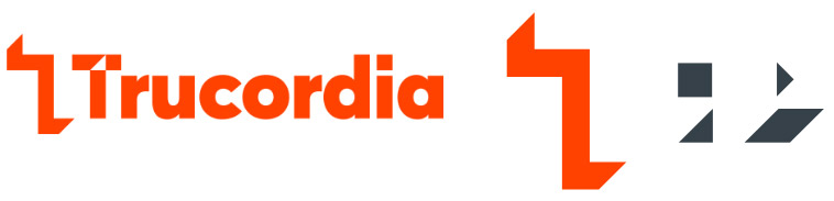
At the heart of the Trucordia brand identity is the three dimensional “T” icon. By deftly combining the icon with the crossbar of the “T” of Trucordia, optical depth is created which makes the eye focus more of the Trucordia word. The shapes created with the interaction of the two “T’s” a simple graphic language was created to aid communications and build consistency across all brand touch points.
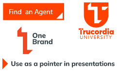
The “T” icon works well as a badge to identify Trucordia mobile apps.
The “T” icon is particularly useful as a framing device for photography, branding any image as a Trucordia image.
The “T” icon also works well as framing device and a divider in PowerPoint presentations, and the angles from the design language helped inform the Trucordia PowerPoint template.
Other examples of the “T” icon and elements of the Trucordia design language in use.
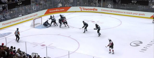
Another example of the design language being used at Trucordia’s sponsorship of the Utah Hockey Club.
The “T” icon itself can also work as repeat pattern for everything from tablecloths to office carpeting.