Redefining and renaming two motion industry giants
The history of Pattison Sign Group goes back to the beginning of the 20th century, when they pioneered the use of neon signs in North America. Today, they are part of The Jim Pattison Group, one of Canada’s largest privately-held companies with diverse business interests across the automotive, media, packaging, food, and entertainment industries. The company continues to deliver groundbreaking innovations in signage as well as industry-leading solutions in architectural branding, maintenance and digital signage solutions, and applications.
Pattison ID Brand video
Challenge
Despite offering these expanded capabilities to clients like Mazda, Honda, and Cinemark, Pattison was still primarily perceived as a sign manufacturer.
Our challenge was to create a unified brand that would bring together all of Pattison Sign Group’s businesses and divisions while signaling the company’s evolution into a full-service provider of turnkey solutions across physical and digital signage and branded environments.
Approach
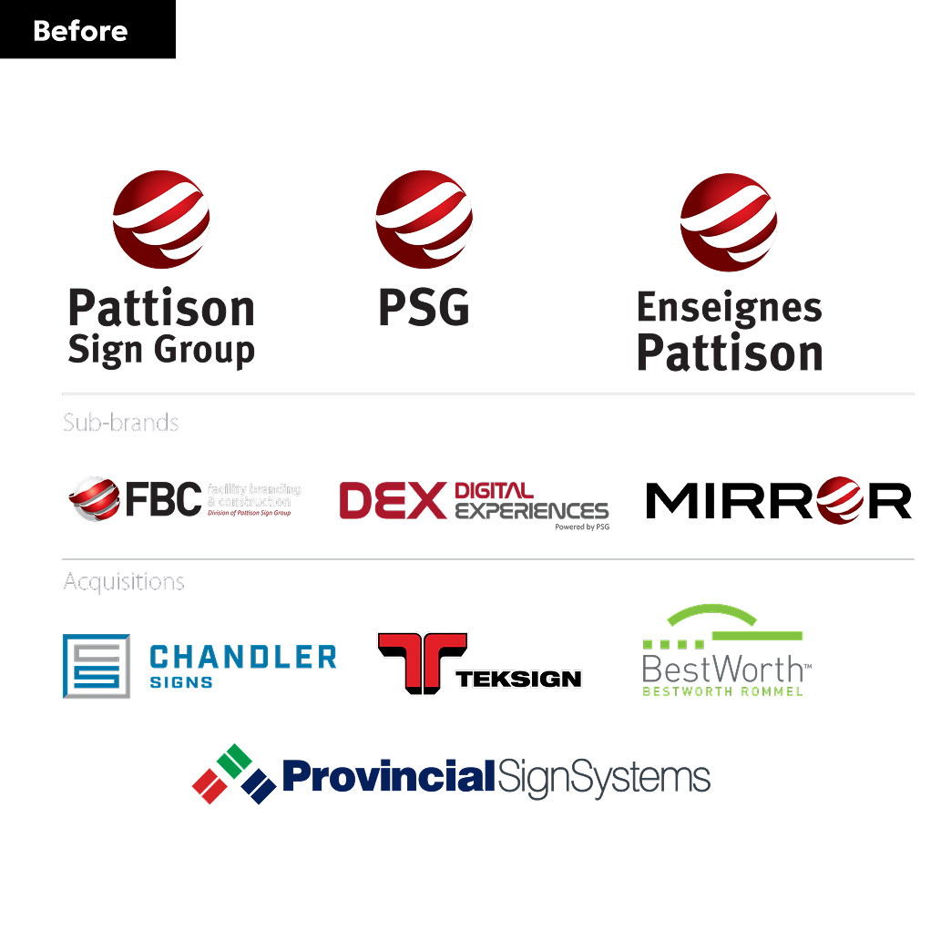
We began by conducting a thorough assessment of PSG’s recent corporate acquisitions and market positioning. Stakeholder interviews and a Brand Story Workshop helped us recognize the substantial equity in the Pattison name, which represented 120+ years of industry leadership. Our strategy centered on preserving this heritage while crafting an identity that would signal the company’s expanded capabilities.
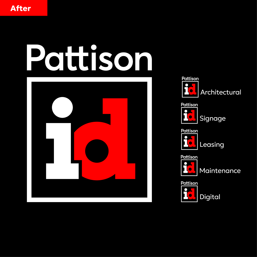
We created the Pattison ID name to consolidate all five companies under a single, strong identity while maintaining the valuable Pattison heritage while clearly communicating their broader service offering.
Because the new name works in both French and English, we were able to significantly streamline the branding needs.
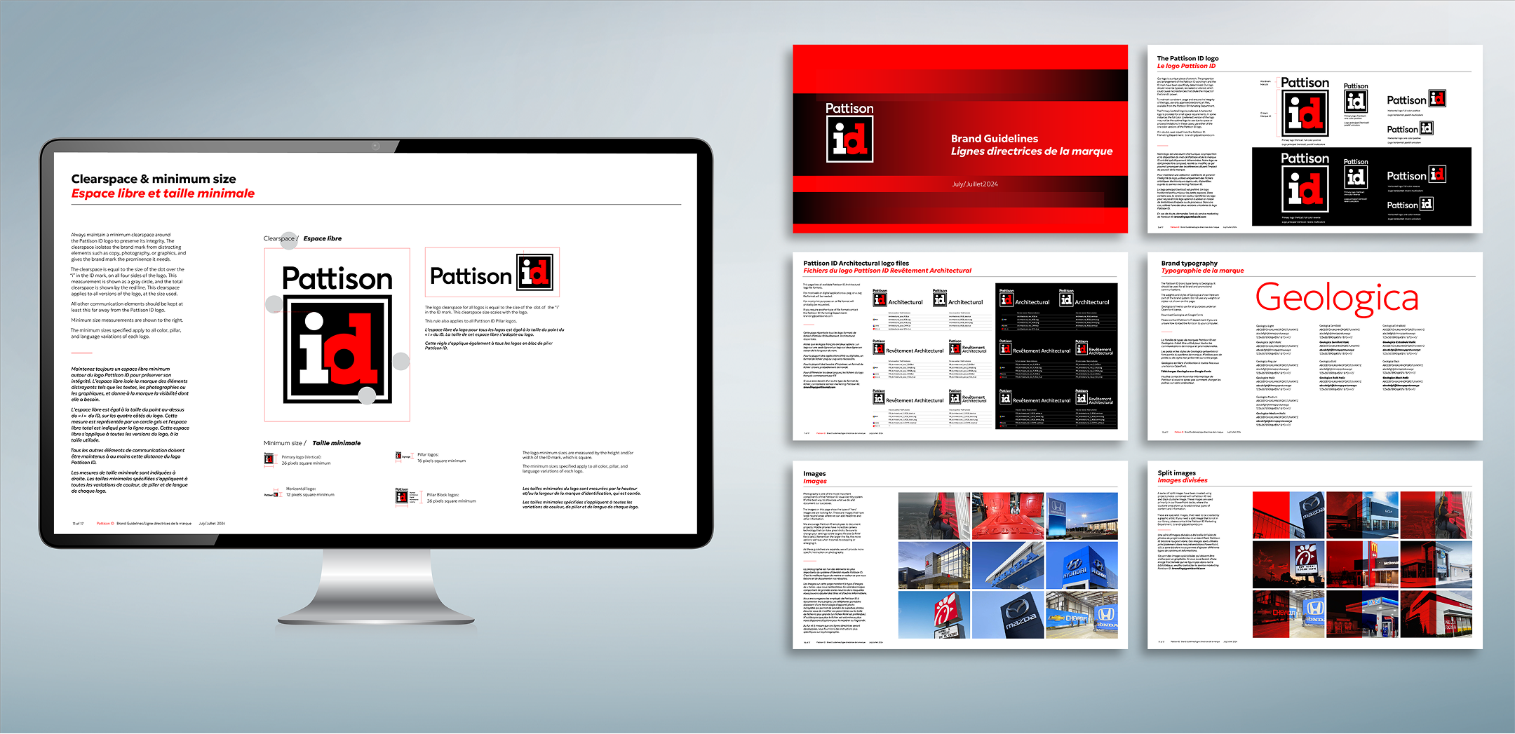
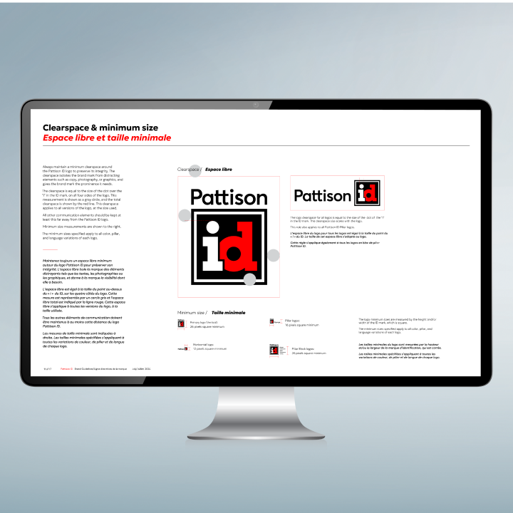
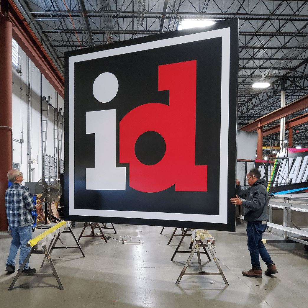
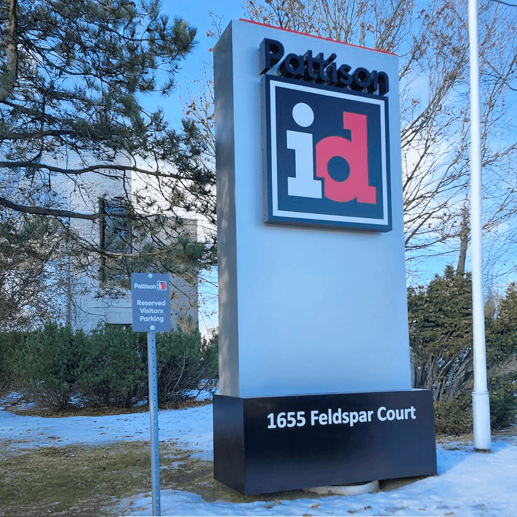
The ID element of the name suggests how Pattison helps companies deploy their identity for maximum consistency, engagement and impact across physical and digital signage and branded environments. The new visual identity features a clean, modern aesthetic with subtle playful elements that reflect the company’s dynamic approach. The square represents many aspects of their business: signs, screens, buildings, and more. And by positioning the Pattison name above this square, we visually communicated their ability to “think outside the box” for clients. The brand identity system also works effectively across digital and physical applications, ensuring consistent expression across all customer touchpoint.
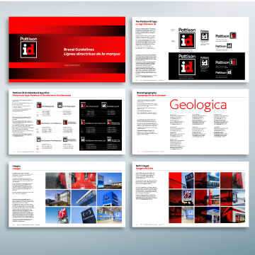
These bilingual guidelines were created to communicate and manage the rebrand across 11 locations in North America.
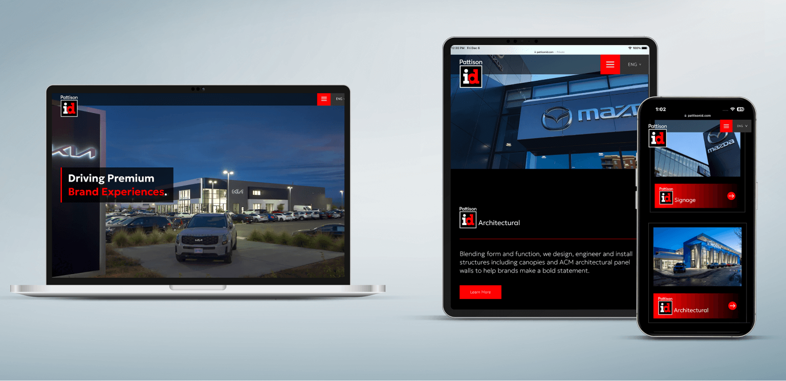
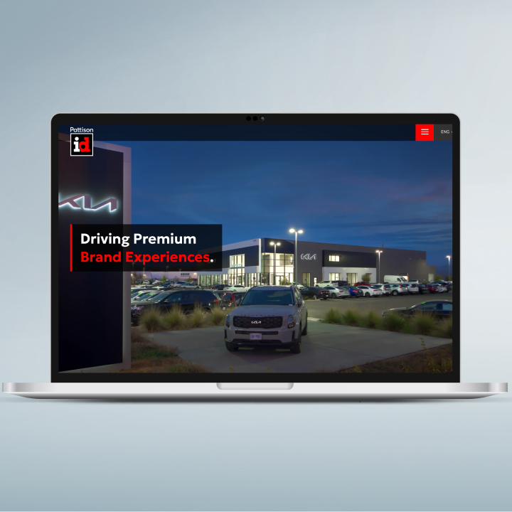
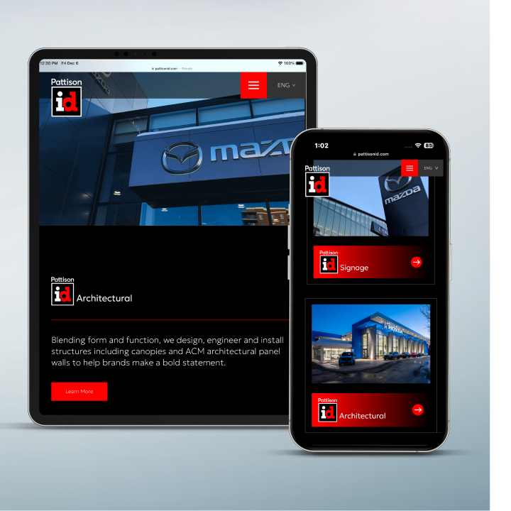
We created a new website for Pattison ID that showcased their capabilities across the five pillars (Architceture, Signage, Digital, Maintenance and Leasing) and the many industries they work in.
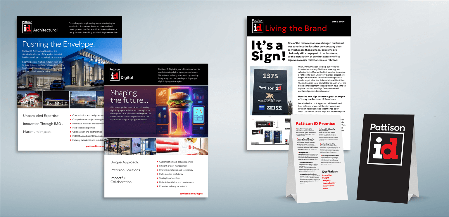
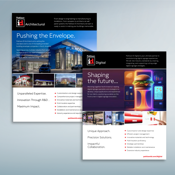
To support the new brand we created several communication templates, including Product Sheets and newsletters, case studies and PowerPoint presentations.
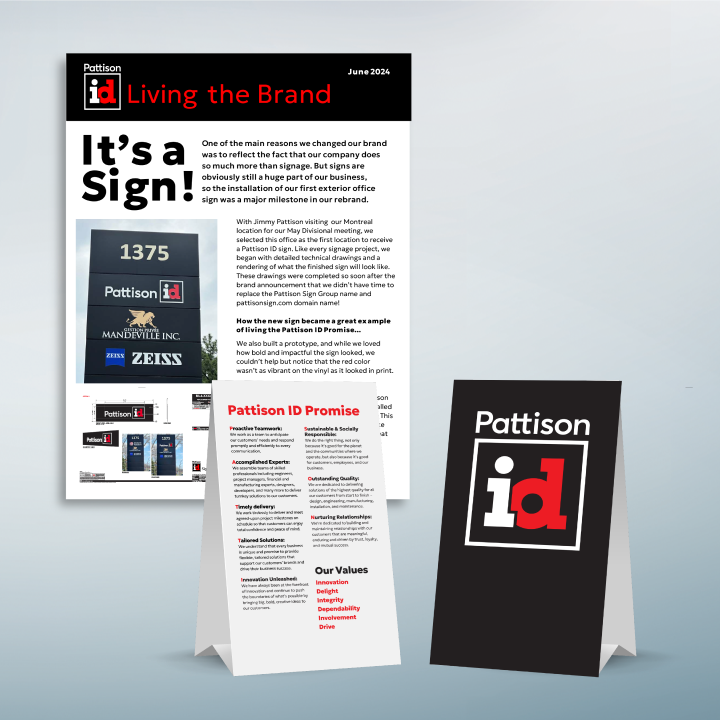
Because Pattison ID offers both Architectural and Signage solutions, the implementation of the new identity on facility signage was a seamless process.